Digital Signage Insider: News, Trends and Analysis
- Written by Merissa O'Reilly
- Published: 23 February 2021

As we put 2020 in the rearview mirror, it’s time to begin looking at the long-term impacts that enduring a pandemic have imposed on retail businesses, which often includes not just stores but also banks, gyms, and other businesses that serve walk-in customers.
We can already see how consumer shopping habits have changed in just a year. Many small businesses lack the liquidity to withstand months of being shuttered, so they have found creative ways to engage customers. Between Facebook, Instagram, and TikTok, numerous local stores found a platform to keep customers interested in their products and services, while focusing and fine-tuning their e-commerce efforts. You can probably think of at least three stores you follow on social media that offered (or are still offering) curbside pick-up to bolster their business, while waiting for restrictions to be eased and shoppers to venture outdoors again.
According to the National Retail Federation, “The biggest takeaway from 2020 is the shift to e-commerce; consumers have embraced online shopping with vigor and retailers have responded with the speedy rollout of new technologies.”
Retailers should consider how sustainable these pandemic-borne business practices may be when progressing through 2021 and beyond. How will small businesses justify more expenditures in order to move into the nebulous “post-COVID” era? Some organizations are able to continue long-term funding of pandemic-adjacent needs quite easily. These include municipal governments, whose operations are funded by tax dollars and intergovernmental transfers. Tax dollars are still being collected, albeit at a reduced rate. It is also more likely that government employees are able to continue working from home, whereas the nature of retail compels employees to work in an in-person environment.
Items that immediately spring to mind as both short- and long-term investments include hazard pay and PPE for employees, additional disinfecting products or services, and technology like digital signage and virtual queuing systems. These investments may be must-haves for many businesses until some time in 2022, but customers may continue to prefer the more hygienic and structured practices well after that. Indeed, shoppers may even seek out the convenience of e-commerce, curbside pick-up, and virtual queuing for long after the pandemic has stopped making headlines.
Di Di Chan, President of FutureProof Retail, projects that the trends with the strongest staying power are those that are easy to implement, simple to maintain, and generate enough ROI. For example, outsourced delivery services, touch-free scan and go mobile checkout, and mobile payments are a few solutions that may remain in demand long past the pandemic. In contrast, solutions that take a lot of manual effort to keep up will have a higher churn rate once they’re no longer a necessity.
While many businesses have closed their doors for good -- in some cases, after decades of being staples in their communities -- there is hope. Almost a quarter of 3,500 business owners surveyed feel optimistic about the future. The light at the end of the tunnel may be a pinpoint now, but we are drawing closer. Though the endpoint will look different than what came before, both small and large retailers are adapting quickly. Consumers have already noticed many of the changes and are engaging in them seamlessly. It’s now just a matter of these COVID-era practices becoming standard practices.
- Written by Merissa O'Reilly
- Published: 17 November 2020

As we approach the end of 2020, a meaningful slowdown of COVID-19 seems unlikely. New cases are trending upwards and it appears that the curve may even worsen as we advance into the winter months. Such trajectories are predicted by the virus’s current R0, or R-naught, value.
It’s important to understand that R0 is not a fixed number. Rather, it’s a “floating” term used to describe how infectious a disease is at a given point in time, due to factors like social contact and environmental conditions that make spreading more likely. And it’s most relevant when everyone in a population is vulnerable to the disease - i.e. when no one has been vaccinated, no one has antibodies (because they’ve already had the disease), and there’s no way to control its spread. An R0 value of 1 means that, on average, an infected person will pass a disease along to one other person. An R0 of 1.25 suggests that one person will infect more than one person, and so on.
In practical terms, this means that if one individual infected with a disease like COVID-19 - which has an R0 value of X as of this writing - does not practice any social distancing measures, they will have infected over 400 people at the end of a 30 day period. If that one infected person reduces their social interactions by just 50%, they would infect only about 15 other people in the same 30 day period. In March 2020, we saw COVID’s R0 drop below 1 after just a few weeks of social distancing. By the end of June though, when many states began to relax their distancing guidelines, that number rose back up, eventually settling between 1 and 1.5.
The world saw the most effective - and strictest - measures taken in New Zealand, an island country with a population of 4.8 million people. From March through April, Prime Minister Jacinda Ardern’s hard restrictions came as the “elimination phase” of lockdown, enabling the country to report no new cases of COVID-19 within the first week of May. This directly led to R0 dropping to 0.4, an infection rate of less than half a person. Though New Zealand saw a newfound emergence of cases in August, the cluster contained only about 30 people. As a country, they positively managed COVID-19 effectively by reducing social exposure, which allowed the R0 to fall.
People should continue to wear a mask or face covering while social distancing, as county and state guidance often remains ambiguous on defining what this means. Digital signage and virtual queuing allow businesses to continue to safely serve their communities by reducing the number of people that come into contact with one another. Digital signage gives these businesses opportunities to clearly communicate with their patrons, while mobile queuing systems like FireCast SmartFlow offer a number of tools to help reduce confusion and give organizations the control they need to effectively manage daily traffic flow.
A digital queue system alleviates many social distancing problems by helping venues manage the number of people who are permitted into a space at any given time, whether they are booking an appointment in advance or simply scanning a QR barcode or sending a text to get in line upon arrival. This reduces the need for public-facing touchscreen devices and other physical touchpoints.
The inevitable ebb and flow of infection rates for COVID-19 will continue well into 2021, and perhaps into 2022. It is likely we will see the R0 value fall below 1 again and rise above 1.25. With companies like WireSpring helping businesses navigate the nuances of social distancing, smart uses of technologies like virtual queues, curbside order fulfilment, temperature scanning kiosks and contact tracing apps will hopefully contribute to a reduction in R0.
- Written by Tony G
- Published: 23 October 2020

The need and opportunity for optimizing in-person queuing has become evident during the last six months. Less than a year ago, customers were able to pile into grocery stores, theaters, banks and clubs without any concern -- aside from maybe reaching the fire code occupancy limit. But today, things are different. Essential businesses must keep their doors open, their stores safe and their customers happy, but concerns about public safety and adherence to social distancing rules has led to many businesses losing their charm and their utility as places for social gathering.
As people wait for the virus to wane and restrictions to be lifted so they can carry on with their normal lives, software companies, hardware companies and signage companies have been trying to mitigate the negative effects of social distancing and lockdowns. 'Wear Your Mask' signs on supermarket entrances, floor markers set 6-feet apart, door greeters and many more low-tech solutions are being used to reduce the spread of the COVID-19 virus, but often at the cost of creating a less-than-satisfactory customer experience.
Meanwhile, technology companies have responded to the crisis by creating and optimizing products to reduce physical foot traffic to businesses (for example, by using e-commerce delivery and video conferencing) and help ensure that in-person employees and visitors remain safe and comfortable. Many customer service-based businesses have implemented appointment booking solutions that help manage the flow of on-site foot traffic, while some retailers, grocery stores and gas stations have been using closed circuit video at the entrances to enforce occupancy limits.
Essential institutions such as schools and hospitals have been more strict, often requiring some kind of testing before entry. Many schools and businesses across the world have started using temperature-taking kiosks at entry points, or manning the doors with employees who use IR thermometers to quickly test anyone wanting to enter.
In a hybrid high-tech/low-tech approach, several bank groups have stationed a greeter at the entrance to help customers make an appointment. After filling out a survey with the greeter, the client is placed in a digital queue that sends text messages as their turn approaches. Other appointment-based businesses are using online appointment scheduling tools that give the user a link to click or QR code to be scanned on arrival to reduce physical queuing in crowded areas. IBM’s Digital Health Pass
, unveiled in early October, is another complementary tool created to give people more confidence in public areas The Digital Health Pass works by creating a QR code based on the user’s vaccination record or COVID-19 test results, allowing for a quick scan to then facilitate entry.
Other large technology companies such as Alphabet, Microsoft and CVS Health have been working on 're-opening' applications that focus on predicting and containing the virus using many different testing and tracing technologies. Smaller tech companies who specialize in queueing technology and digital signage, like WireSpring, are rapidly iterating on greeter-free virtual queuing options that let patrons pre-book appointments themselves, or scan a QR code on arrival to be placed into a digital queue.
With lockdowns expected to continue into 2021, businesses and their customers will likely continue to lean heavily on new technology to reduce the stress of dealing with social distancing and other restrictions until the threat of the COVID-19 virus eventually declines.
- Written by Tony G
- Published: 04 November 2020
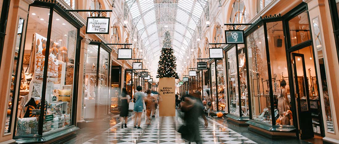
Photo by Heidi Fin on Unsplash
Gearing up for the holiday shopping season, big box stores like Walmart and Target have increased their tech presences to help cope with the ongoing effects of the pandemic. While smaller stores and businesses might lack the online presence and queuing systems to readily adapt to a virtual shopping experience, big retailers who have been well equipped with smart and contactless technologies for years are seeing more customers utilize their self-service offerings. While many stores seem less packed, customers have been flocking to online ordering and pick-up services to avoid line-ups, keeping staff busy and visits socially-distanced. Some of the most sophisticated offerings even let people order online and have store staff deliver the items directly to their cars parked at special ‘Drive-Up Spots’.
Nearly all of these technological advancements are made possible by dramatic improvements in Internet of Things (IoT) systems that have matured over the last decade. The IoT tech sector is expected to be worth over $94 billion by 2025 as retail stores and others see the demand for improving the delivery of products and services. Some key IoT technologies that are driving growth include cashier-less payment systems, wireless shipment tracking devices, inventory management tools and even in-store buyer behavior tracking. Walmart CEO Doug McMillon has fully embraced IoT devices within Walmart stating, “The internet of things, drones, delivery robots, 3D-printing and self-driving cars will allow retailers to further automate and optimize supply chains too. Both sides of the equation – demand and supply – will change dramatically.” And numerous experts have chimed in to give their predictions of what retail shopping will look like in the not-too-distant future.
Target, who has also fully embraced an IoT retail future, has seen record profits and high stock values in 2020 as the demand for consumer goods has outpaced economic concerns for many. The double edged sword for small retailers who didn’t embrace e-commerce or contactless technologies has forced them to close their doors during the pandemic creating a win-win scenario for large warehouse businesses as consumers were left with fewer retailers to choose from. Large retailers have also made many efforts to keep their customers safe and coming through their doors by sanitizing carts and baskets between use, making masks available and required, monitoring social distancing rules and implementing dedicated shopping hours for vulnerable guests. Big box stores have also increased their labor forces, creating new warehouse, customer service and delivery driver positions to address changing shopper habits.
New retail based technologies are still arriving to create an even better online shopping experience. Fit:Match, a company that has created a virtual fitting room based on a database of clothing measurements from different fashion designers and clothing companies have rolled out an e-commerce platform that uses a 3D model of the shopper (attained by visiting a Fit:Match measuring location) and finds the best fitting clothing based on AI matching. Other technologies waiting in the wings, like ‘smart carts’, will allow an in-person shopper to pay for their items directly on the shopping cart to avoid the checkout lane entirely.
I think we can expect to see even more changes in 2021 and beyond, as shopper culture continues to adapt to the new normal of the post-pandemic world. It will be most interesting to see how big retailers continue to push the envelope. Unlike smaller shops, these large stores might be able to do as well -- or better -- with shoppers who use mobile applications and other tools that give customers better control over their shopping experience rather than spending their time pushing carts down the aisles. While in-store visits still drive the bulk of store profits for even the largest retailers, in the future, the power and convenience afforded by new tech tools could well change that.
 Subscribe to the Digital Signage Insider RSS feed