Over the last two weeks, we’ve been revisiting one of our most popular blog article series, "Making Great Digital Signage Content", through a series of posts on LinkedIn. If you haven't been following us on LinkedIn, be sure to connect with us for the latest updates and best practices. And with the current challenges many businesses are facing, we thought it would be a great time to recap our tips for creating effective digital signage.
Great digital signage can maximize exposure, influence customers, and help visitors remember information more easily. One of the biggest things to keep in mind when creating content is that digital signage is different from printed signage and ads. Though there are more avenues for you to really make an impact on your audience, there are also some common pitfalls when moving to the digital medium.
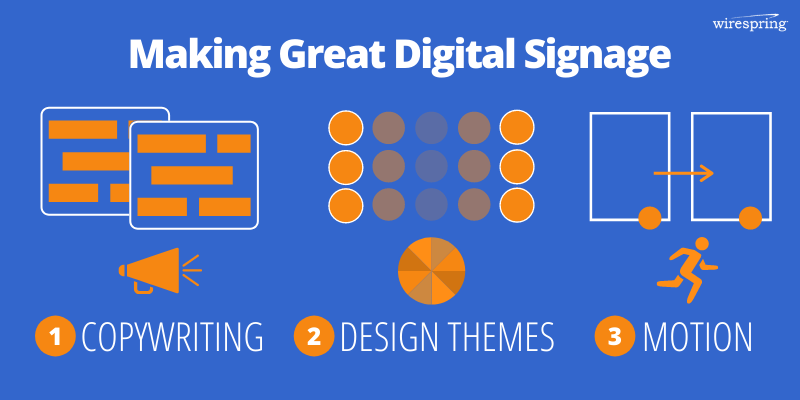
Key Takeaway: There are really only three things to focus on:
- Crafting Effective Copy
- Choosing Design & Brand Themes
- Utilizing Motion
We'll go over some best practices in each aspect, but these three themes will lead to you maximizing the outcomes from your digital signage campaigns.
Effective Copywriting
Effective copy is all about making sure your text is clear and easy to read. The most important line of text you will write is your call-to-action (CTA), so let’s start by addressing that first. Many people tend to overthink how their CTA should read, but we've found that writing a short and actionable command statement works the best, because there is a greater chance the viewer will act upon it. Apart from that, make sure to keep the CTA straightforward in terms of grammar and language used.
Of course, your CTA isn't the only text you’re writing for your signage. When it comes to conveying all the other information, we can actually introduce a bit of psychology in order to increase recall rate and understanding. The first way is to use a popular mnemonic technique called chunking and coding, which is when you arrange your information into smaller groups of similar items that makes it easier to remember. The modern-day phone number format in North America, e.g. 954-555-1212, is an example of this. Another memory principle we can use to our advantage is the serial positioning effect. This effect states that an element's position in a list affects its recall. So how can you take advantage of this phenomenon? Simply arrange the information that you're presenting to increase the odds that the most important messages will be remembered. We recommend limiting your list of information to 5-7 points, with the most important points appearing at the beginning or the end of the list.
Design Standards
The next key element in putting your content together is design (in the traditional sense). When we think of design, we often think of color. For many of us, different colors represent different emotions when we see or interact with them. Though there is research on how colors can cause mood shifts or even decrease blood pressure, most viewers will not pay enough attention to the digital sign to feel this effect. Contrary to popular belief, there is no overarching relationship between color and content performance, especially when it comes to glance-type digital signage. Instead of worrying about what kind of connotations certain colors have, it’s better to stick to your brand colors and build from there.
Now, you may be wondering why certain signs or ads stand out to you more. The design element that you are actually getting affected by is contrast, which arises from the color combinations, not the actual colors themselves. Because digital signs emit light, their ability to show contrasting colors actually changes with a person's viewing angle. This makes contrast far more important when it comes to getting your content noticed because it can have a big impact on how easy it is to decipher content on the screen.
Motion In Digital Signage
The last and most important differentiator between print and digital mediums is that digital gives you the freedom to move images around the screen. However, poorly-planned motion can actually decrease visibility and readability. Check out our separate article on the 7 important things to keep in mind when using motion, but on a high-level, the biggest thing to keep in mind is to never let motion interfere with readability. This means no drastic movements to your text and allowing enough time for viewers to read.
Lastly, a common mistake people make when composing shots is assuming that their audience will watch their entire segment, however long, from beginning to end. That could not be further from the truth! For a vast majority, they may never see your clip in its entirety. The best way to compose scenes is to treat each slide as a standalone poster. This way, your audience isn't left with bits of information without context, while also maximizing the chance of getting your message across to an increasingly distracted audience.
Creating effective signage can be a challenging process of trial and error. And while we haven’t uncovered a secret formula that eliminates the need to test, study, and repeat, we hope to have equipped you with some best practices to streamline your content creation process and get better results from the get-go.

 Subscribe to the Digital Signage Insider RSS feed