Concept, style, and the path to "good enough"
Unfortunately, figuring out the combination of visual elements, styles, and colors that will elicit the best possible response is next to impossible. For starters, you would have to test a huge number of variations. Next, as long as different people continue to think and act differently, you (the designer) will come up against the law of diminishing returns once your content is "good enough" for most people. But what's the quickest path to "good enough," since even getting that far might take more time than you care to invest?
After a lot of research, we've concluded that there are basically two kinds of changes you can make: concept changes and style changes. Here's an example: A concept change would be deciding whether or not to use the pink bunny in your Energizer spot. However, a style change would be deciding whether to have it on a black background or a white one (gross simplifications here, but hey, these posts tend to run on too long as it is). Aside from a few high-level generalizations, there's no way I could possibly tell you what the right concept for your brand/product/category is. That decision usually gets made by people high up the corporate ladder as part of an overall strategy or campaign. But what I can talk about, after lots of trial-and-error testing, are some important style changes to try out -- particularly style changes that affect the contrast of your images.
Adding contrast to the mix
As we alluded to last week, one of the first things that designers try to tweak (whenever possible) is the color scheme of the content. Admittedly, there are cases where tiny changes in a color or gradient can really improve the aesthetics of a piece, whether it's on TV, in print or on a digital sign. But as it turns out, contrast, not color, is far more important when it comes to getting your content noticed, watched, and remembered. Because digital signs -- whether LCDs, LEDs or plasma displays -- all emit light (as opposed to regular posters which reflect ambient light), their ability to show contrasting colors actually changes with a person's viewing angle. Thus, if somebody glances at your screen but doesn't see it head-on, they might miss the bright colors and clever imagery that you're using. In the worst case, all they'll be able to see are the outlines between light and dark areas. I think that's why changing the contrast of different visual elements can have such a significant impact on the overall readability and recall of digital signage content.
Not surprisingly, Clear Channel and other billboard companies have done a significant amount of research on which color combinations are easiest to see and read, and we've found that their conclusions hold up extremely well for indoor digital signs too. For example, consider these four color combinations:
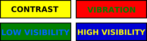
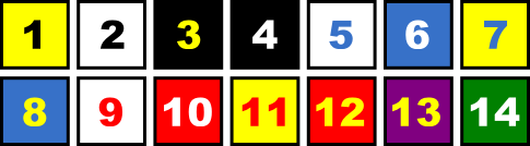
Overlapping areas of complementary colors (for example, red and green) are difficult to focus on because our brains tend to interpret the different wavelengths of light that they use as slight vibrations. This makes the text harder to read and other visual elements harder to distinguish. Likewise, overlapping colors with a similar color value (brightness) will be difficult to distinguish for most people (and virtually impossible for the color blind). This problem is worse on LCD screens, which have the most trouble maintaining high-contrast imagery when the viewer isn't standing more or less directly in front of the screen. To maximize exposure and guarantee that signs are noticed and read, Clear Channel also makes a few recommendations, including this palette of 14 high-contrast color schemes for use in outdoor billboards:
Black and yellow provide the most bang-for-your-buck when you're designing out-of-home ads, even though black-and-white would be a higher contrast choice. The reason has to do with the physiology of the eye as well as the context where the ads are seen: Since black and yellow have both different hues (colors) and values (brightnesses), the eye readily distinguishes between them using both its rods (brightness detectors) and cones (color detectors). From a context perspective, yellow is less prevalent than white in the typical outdoor environment, so yellow content tends to be more eye catching. Content creation for digital signage is essentially a constant struggle between getting noticed and getting remembered. Thus, the small tradeoff in readability by using less-contrasting yellow instead of white can be justified by the greater chance of grabbing a viewer's attention in the first place.
How better contrast buys you more impressions
The contrast between foreground and background can have a big impact on how easy it is to decipher content on the screen. In some cases, even a minor tweak (like increasing the contrast between foreground and background by 10%) can make the content recognizable to a much larger potential audience, since people can see it from a wider angle. Contrast also has a direct impact on readability, which in turn influences how well viewers will recall your content. So, make sure to consider what your spots look like to people across the aisle, down the hall, or on the other side of your lobby. What looks spectacular on your monitor 18" away may be indecipherable if you move back a few feet or turn your head by just a few degrees.
Next week, we'll delve into another area where contrast is critical: separating out moving elements so your viewers can focus on the important part of your message. One of the big advantages of digital displays is their ability to show moving images. But believe it or not, using motion doesn't always make content more eye catching. We'll investigate how to include the right amount of movement when we talk about silhouettes, our term for contrast-in-motion.
Meanwhile, if you have any tips on how to create high-contrast content while keeping the style guide police at bay, leave a comment and let me know!
 Subscribe to the Digital Signage Insider RSS feed
Comments
RSS feed for comments to this post