7 things to keep in mind when using motion
Fortunately, there are a few tips and tricks you can use to avoid such problems. As you'll see, they're basically extensions of the best practices we've discussed in past articles. To begin with, consider these seven key points:
- Just because you can make it move doesn't mean that you should. Chances are, the out-of-home environment where your digital screens are located already has a lot of visual clutter. This is true for retail stores, health clubs, airports and practically everywhere else. Adding motion to multiple screen elements may not make them any more noticeable or visible from a distance. So far we've only found this to be true in very cluttered environments, but you'll have to try it in your own venues to be sure.
- Don't let motion interfere with readability or comprehension. This one's easy: if you're relying on text to get your message across, and the motion you've added makes the text harder to read, your content's performance is going to suffer.
- You get only 1.5 - 3 seconds of full attention for glance media. Thus, any period when important text or other critical message components are off the screen is potentially a missed opportunity to connect.
- Leave enough time to read the text. Don't trust your own judgment -- if you're the designer, find somebody who hasn't seen the content before and make them read it. If they can't read your message at least three times in the alloted amount of time, either take out some text or leave it on screen longer.
- Treat moving text like it's not there at all. I'm not talking about a slight jiggle or flash here and there, but if you have content whirring across the screen from left to right, nobody's going to be able to read it -- or at least, not all of it. So if you really want to make sure there's enough time to read your text, don't count your transition times towards the amount of time you're leaving it on screen.
- Motion on the periphery is more subtle than motion in the middle of the field of view. A small animation on the border of your screen will exaggerate the eye's natural left-to-right sweeping motions as it reads along. Putting animation in the middle of the screen next to text will pull the eye away from the text during these natural eye motions, which are known as saccades.
- The most important features of your spot should be static. If you have an easily-recognized or well known logo, a common catch phrase or slogan, or some trademark imagery, keep it on screen for the full length of the clip. That way, even people who don't get the chance to see the clip in its entirety will still be able to associate what they've seen with your brand or core message.
 Using moving silhouettes to your advantage
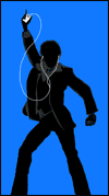
One of the most useful tools we've found for understanding the impact of motion on readability is what we call silhouette, or the relative contrast patterns of moving images. Because our peripheral vision is only really good at picking out shapes and outlines, we naturally identify items that we're not directly looking at by their contrast against the background. Thus, you could say that a moving image's silhouette is the only thing noticeable about elements in a viewer's periphery. Moving elements that have a strong and easily-identifiable silhouette will take fewer cognitive resources to identify than those with less recognizable silhouettes. Of course, a silhouette profile of a moving element will change as that object moves, so it's important to make sure that simple motions are exaggerated and lines are kept as clean as possible during the movement. Consider the following:
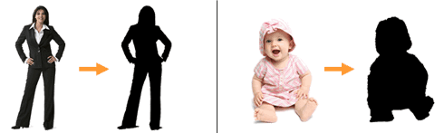
Most viewers with average vision will have no problem discerning these images when looking directly at the content. But for customers merely glancing at it (or even subconsciously watching it in their periphery), all they will see are object outlines -- especially when objects on the screen are moving. Consequently, the image on the left will be much more "recognizable" at-a-glance because of its strong silhouette. This is true even though the image on the right uses a distracting attention vampire that would normally suck attention away from other elements when viewed head-on. Plus, silhouettes aren't just important for getting people to notice your content from the periphery. Moving images with a strong silhouette can be also moved, scaled or rotated without significantly reducing comprehension time for direct onlookers. So, your fancy visual effects will have less negative impact on readability and comprehension if they modify elements with an easily discernible silhouette.
Next week, we'll put together everything we've learned so far while examining the last critical component of any good digital signage spot: the scene composition. Just as each shot in a well-crafted movie is carefully laid out on camera, so too must our ads and announcements be arranged to form a cohesive product.
Perhaps you agree with all this academic stuff. Or maybe you've got your own ideas about how to make content great. Either way, leave a comment and let us know what you think about using motion in digital signage.
 Subscribe to the Digital Signage Insider RSS feed
Comments
RSS feed for comments to this post