Six steps to better composition
As you may have guessed from reading our recent articles on content production, people are still over-thinking how their pieces should work. We continue to see highly complex spots that, while produced with very high production values, demand too much viewer attention for far too long to be viable in the field. While there's no guaranteed, 100% effective solution to this problem, we've found one approach to be extremely useful: treat the clip as a series of scenes and shots. Just as a movie director composes a film from numerous small pieces, effective digital signage content can be constructed from segments designed to catch attention and relay some information quickly -- sometimes in a mere second or two. To maximize the chance of getting your message across to an increasingly distracted audience, try to remember that digital signs work more like posters than TV. We recommend the following procedure when going from the idea phase to the production phase of your content creation process, which is kind of like storyboarding in reverse:
- Articulate your core idea as a series of messages that are only a few words long (no more than a sentence).
- Think of a single image or visual element that goes along with each of these core ideas. (One image per, for now. Don't worry, you can add more later!)
- Now, take each message-visual combination and mock up a quick poster. For example, think about what a movie poster might look like for the message "Tide gets your whites whiter!" Each mini-poster should stand alone -- i.e. poster #2 shouldn't depend on content from poster #1.
- If you're using a voiceover or other dialog, try to segment it into sound bites that go along with each poster instead of using a single, contiguous speech.
- Assemble related "posters" together into scenes with transitions and segues that link them together, but don't make them depend on each other.
- Finally, assemble the scenes into your finished spot.
 Real-life examples
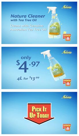
If done correctly, you'll be left with a cohesive piece of content that can still get useful information across to people who might only look at it for a few seconds. One of my favorite examples for illustrating this kind of technique comes from Artisan Complete, a retail POP/out-of-home media company based in Canada. The images to the left come from an ad for Natura cleaning products that they entered into the POPAI Digital Signage Awards contest in 2007. Though the complete segment is a full minute long, it's divided into several shorter segments. Each of these shorter segments, in turn, can be broken up into individual shots that are clear enough to function like regular posters. Each stands on its own, and while the subsequent scenes reinforce previous ones, none of them depend on each other.
The Natura clip ran in Home Hardware stores in Canada, and it was scheduled to appear on screens that were placed directly above piles of the featured products. Thus, even though the last screenshot on the left doesn't include an image of the product or any other information, it still served as an effective advertisement of the product's availability, and provided a call-to-action that was easy for viewers to act on. Even better, it didn't require the viewer to see any of the other segments to understand it.
Bringing it all together
As you design your individual "posters", arrange elements using the information we've outlined on this blog over the past few weeks. All of our standard rules apply: use short blurbs of text that are easy to chunk and code and are ordered to take advantage of the serial position effect. Include a call-to-action. Use an attractive font. Avoid unnecessary distractions. Use color and contrast to your advantage. Check moving elements to make sure they're discernible from the periphery.
While it would be nice to say "follow these tips and you'll have great content," of course it isn't quite that easy. The past few blog articles illustrate some best practices for digital signage content creation, but it's still going to take a good deal of audience research, design savvy, and, of course, creativity to produce spots that really stand out. However, all of those things equal, I'm confident that content designed with our recommendations in mind will show consistently better performance (in the firm of higher comprehension and recall rates) than those that don't.
What's on the horizon?
So, what will we cover next? We're doing more research on content length (duration), screen placement, multi-zone versus full-screen content, best practices for using sound, store integration, and multichannel marketing, so expect to see those types of articles in the future. I don't have enough data about any of these topics to make recommendations quite yet, but that's probably a good thing. Frankly, it's been a while since we've covered any of the interesting things going on elsewhere in the digital signage industry.
I'd love to hear your feedback too:
- Have the articles in our "Making great digital signage content" series been useful?
- Did you learn something that might change how you design your content?
- Do you disagree with anything we've covered?
- Is there anything you'd like to add?
 Subscribe to the Digital Signage Insider RSS feed
Comments
RSS feed for comments to this post