The Digital Signage Insider

How Does the DOOH Money Flow? [INFOGRAPHIC]

Published on: 2012-02-22

A few months ago, Digital Signage Today published a fairly compelling infographic illustrating how digital signage is "all around us." While I stopped reading WIRED magazine (a heavy proponent of the infographic format) back in the 90's, I can still appreciate pretty pictures loaded with numbers. In particular, the infographic from Digital Signage Today does a good job of explaining in layman's terms exactly how and where one might encounter digital signage systems out in the real world, while also shouting about all of the billions of dollars we're all making by serving trillions of impressions to quadrillions of prospective viewers... or something like that. I had this image in my head recently while talking to an especially savvy customer. Eager to expand into the digital signage space, the customer was having trouble understanding how the money flows in a typical DOOH network (for some reason they kept thinking I was joking when I said "it doesn't"). Instead of trying to write up a whitepaper that would never be read or a text-heavy blog article that would could easily be glossed over, I decided it might be more fun and more educational to present this capital flow in infographic form.

Behold the DOOH money flow infographic

This is basically my first try at any kind of infographic (aside from various charts and ecosystem diagrams), and I'm a bit ashamed to admit that I created it in PowerPoint. However, what it lacks in aesthetic appeal it hopefully makes up for in utility, since it's the first document of its kind that I'm aware of.


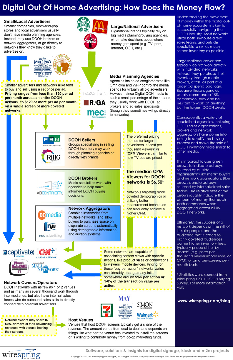
(Click the image above to see the full-size version, or download the PDF.)

What's going to happen to the aggregators, brokers and sellers?

It's no secret in our industry that the companies built specifically to serve DOOH networks are having a very hard time. In just the past few months, several DOOH aggregators (including some of the more prominent ones) have closed up shop, and I have no doubt that more will follow. However, taking those institutions out of the infographic literally leaves a big gaping hole in the middle -- and that's not just a design issue. As I see it, the problem is that these companies really do fill a need. Unfortunately, it's just not as big or well developed as their cost structures would have us believe. Thus, my prediction is that even if many of the intermediaries listed in the graphic disappear in the next 12 months, a new crop will necessarily come up to replace them. And even if that next batch fails, the process will be repeated until the industry's technology, logistic and business growth realities line up and make such firms viable. Until then, I don't think we're going to see anything more than the anemic fits-and-starts growth that has characterized the DOOH industry in the past.

How did the infographic come to be?

The general "shape" of the graphic is based on numerous conversations with customers, partners and colleagues, none of whom seem to really know how this stuff all goes together outside of their own direct experiences (and all of whom were quite ready to admit that fact). The market statistics were sourced from our own survey on how people buy and sell DOOH advertising, the results of which were published in a series of blog articles: While the concepts outlined in each text block are obviously simplifications of how things really work, I originally put this graphic together to circulate amongst digital signage neophytes who have literally zero understanding of the advertising industry. As such, I had to gloss over (or outright omit) a lot of details. However, for all its shortcomings, we've already found this infographic to be pretty useful, and I hope you will too. Like all things on this blog, it will be a perpetual work in progress, and I'll certainly take any constructive criticism into account when making future revisions.

Does the DOOH money flow infographic reflect reality? Do we need to make any changes? Do you have data that you'd like to contribute? Leave a comment and let us know! (Email/RSS subscribers, click through to /blog to comment.)

Comments   

0 # Blanca Landis 2012-02-23 19:20
Great article, Bill. The infographic is very helpful and easy to follow and understand. I also think media planning agencies and advertisers by themselves should be more open to DOOH networks and let the communication with them to be easier. Both can work together on the campaigns and make this industry growing and make it better for everyone; improving on creativity, innovation, quality, service, delivery, etc.
0 # Bill Gerba 2012-02-23 22:50
Hi Blanca, thanks for the feedback. I agree, we'd be much further along as an industry with proper buy-in from Madison Ave. However, they make a fair point: why should they devote time and effort to DOOH deals when they can make more money doing the "simple" traditional media deals they've become so expert at?
+1 # Malepantsi Jobo 2013-01-22 09:53
I am starting a DS advertising in a developing country where loans arent easily accesed. I started with two screens at the moment. the bussines just has a month and Im using only a screen with a flash drive which loops the contenct played. I need a supplier of screens which can supply more screens and I'll pay over a piriod of time. Do you have an idea which companies can buy into my story. The market is just developing and its good for inverstors to do so. Personally i was looking into partnering with Sumsung, especially with their 2020 vision of archiving $400 billion revenue. Any company willing interested, my contact details are 0026659674646. Im in Lesotho

Subscribe to the Digital Signage Insider RSS feed


Looking for more articles and research? Our newest articles can always be found at Digital Signage Insider, but there are hundreds of additional research articles in our historical articles archive.


You may also be interested in M2M Insider: our blog about M2M and the Internet of Things.