What's the Dead Zone of Slick?
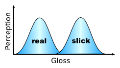 To explain the Dead Zone of Slick, Godin recalls a time when he encountered some musicians playing to pedestrians at his local farmer's market. Impressed by their music, he bought a CD. Unfortunately, as much as he loved the live band, he hated the album. His explanation?
"Faced with the excitement of making a CD and all the knobs and dials, they overproduced the record. They went from being two real guys playing authentic music, live and for free, and became a multi-tracked quartet in search of a professional sound. And they ended up in the dead zone. Not enough gloss to be slick, too much to be real."Not enough gloss to be slick, too much to be real. That one sentence pretty much sums it up, but if that's still too much to get a handle on, he provided a handy illustration. While the very real and the very slick have an equally powerful effect on perception, stray too far in either direction and you lose that power. It's easy to understand why that might be the case for things that are obviously phony (to the far left side of the curve), or things that are hyper-slick but lacking substance (to the far right). That bit in the middle between real and slick was less obvious to me. In retrospect, it makes perfect sense.
What does it mean for the creative process?
My argument -- articulated in a series of articles about making great digital signage content -- is that nearly anybody can create effective, memorable content by focusing on the fundamentals. This includes having a clearly articulated message, clean graphic design, and a strong call to action. Going by "The WireSpring Method," you don't have to be the world's most amazing graphic artist or Flash animator to make content that's thoughtful and compelling. You just have to be clear in your intent and understand how your audience is likely to consume content on your medium. Whether we're talking about TV, online banner ads, or digital signage, the same guidelines will apply.
But some people say the fundamentals are over-hyped. In their view, what really takes content to the next level is the slickness: fancy effects, killer soundtracks and the like. Pat Hellberg, who spent 19 years at Nike and led their in-store media efforts, happily plants his flag in this camp. As he wrote in a recent article: "During our years of creating content for the Nike Retail Network, I can't recall a single discussion about fonts, color or contrast. I worked with brilliant graphic and motion designers whose instincts led them to the appealing and to the attractive. That's what artists do. They create content that they know, in their gut, makes things 'beautiful, attractive and desirable.'"
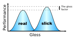 With these two perspectives in mind, let's re-visit Godin's illustration and make a couple of modifications so it better fits the digital signage content creation model (or any other highly visual medium, for that matter). Let's replace his "perception" with "performance", since that's what we really want to measure, and introduce something called the "gloss factor" (which we'll get to in a moment). But first, let's talk about the "real" and "slick" curves. If you keep your content "real" by sticking to the fundamentals, you're going to get good results. That's the same as Godin's original illustration would suggest. But if you can keep it real and pump up the gloss a little, then you'll probably get even better results. Pat Hellberg and his team might not have been consciously thinking about fonts, colors and contrast when working on their in-store media. But a fundamental understanding of these things is going to be second nature to the kinds of brilliant graphic designers he was working with. So he essentially got the fundamentals -- the "real" -- for free, and was able to focus his team's efforts on the gloss to wring a little extra goodness out of each piece of content they produced.
Is being slick worth the effort?
In most cases, the "gloss factor" can only buy you a small boost in overall performance. So the question to ask yourself is, "Is it ever worth the effort?" After all, artist time is not cheap. Spending a few thousand dollars more to make something that both meets the fundamental criteria for good in-store media content and looks cool as all get-out is only going to be worthwhile when it helps you meet specific goals that offset the additional cost. Further, the type of objective you have in mind (e.g. to drive additional sales, enhance brand image or do something else entirely) will affect how you calculate that value to begin with.
I've watched many well-funded companies fail at the digital signage game in the eight years I've been doing this, so perhaps I've become something of a miser. But even with that in mind, I'm confident you'll get the most bang-for-your-buck by following our recommendations for great digital signage content. Any reasonably skilled designer can quickly get up to speed with those tips and start making attractive clips that are both memorable and compelling. But if time and money are no object, and your design team has already shown a full mastery of the basic concepts, there may well be some added value to giving your content that extra gloss. Just be aware that the additional time and money you invest may never be recuperated -- and might have been better spent elsewhere.
Have you ever seen content that tried to be slick, but ended up just looking fake? Did it fit the model I outlined above? Leave a comment and let me know.
 Subscribe to the Digital Signage Insider RSS feed
Comments
RSS feed for comments to this post