Where did our original calculations fall short?
Our first chart of what we dubbed the "Digital Signage Industry Composite CAGR" featured a funny looking predicted growth curve that didn't seem to fit the actual industry size numbers that had been reported. At the time, I didn't really offer up an explanation for why this might be, but just yesterday an eagle-eyed reader figured it out:
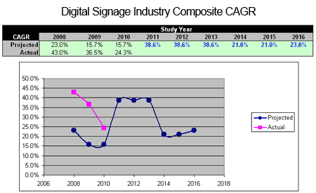
In short, the January chart is wrong. The data for 2008-2010 was plotted properly, but the projected growth numbers for 2011-2013 needed to be divided by three to make the calculations correct. While I was in my spreadsheet fixing the chart, I decided to do a brief web search to see if any of our target research firms had updated their information. A handful of Google searches and a few minutes later, I was rewarded with updated information from our friends at IMS Research (now owned by IHS Inc.), as well as a report from another firm called MarketsandMarkets.
Armed with this new data, I updated our Digital Signage Industry Composite CAGR chart to plot the expected growth of the industry through 2016:
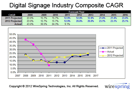
With the math fixed, the research firms' growth expectations look a lot more reasonable, though the MarketsandMarkets survey is very optimistic and skews the composite result upward by a few percentage points. While the actual growth trend may look dire, keep in mind that we only have one data hard point for 2011 (supplied by IHS in the above-linked report). Also, the "actual" growth rates reported by all of the major research firms a few years ago were just preposterous. I think it's safe to say that virtually nobody experienced 43% CAGR in 2008 or 36% in 2009, so the sharp dip of the pink line simply reflects a correction once the research firms got a better grip on the actual behavior of the market.
What's the key takeaway this time around?
Well, we can't say much for sure until PQ Media and/or ABI Research update their own reports. But so far, it looks like 2011 was a fairly good year for the digital signage industry. However, if the projections from all four of the featured research companies are to be believed, 2012 should be quite a bit better, and it should be pretty smooth sailing for the next few years, barring another macroeconomic catastrophe.
Personally, I wouldn't hang my hat on the statement above. But anecdotally speaking, I think a growth rate of around 20% for 2012 seems perfectly reasonable. Still, it's strange... even though everything from the source data to the mathematical calculations above feels like more art than science, I'm still looking forward to updating this exercise in futility the next time one of the research firms updates their findings.
 Subscribe to the Digital Signage Insider RSS feed
Comments
RSS feed for comments to this post