Advertising Age published a showcase of the top 12 ads based on the GfK Starch research, and I've picked a few of them to analyze below. As you read through each one, notice how closely the best practices for print mirror our recommendations for making digital out-of-home content.
Ad: Sony
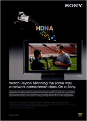 |
GfK says: Black backgrounds lend a kind of three-dimensional effect to an ad, particularly if the image in the foreground is colorful and contrasts sharply with the background. In such cases the image practically pops off the page. We say: Here's a great example of something that works great in print, but is usually a bad idea for digital signage. Remember, digital screens emit light, whereas printed images reflect it. That means while your print ads can look great and utilize high-contrast white-on-black schemes, doing this on your digital screens will result in a dim image that will attract less attention than one using a brighter background. |
Ad: Cobra
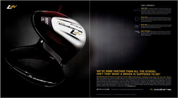 |
GfK says: One of the most basic of the Starch principles of effective advertising is "Keep it simple." Cobra does not clutter the page with extraneous material, but provides one key element, the artfully positioned club heads, as a powerful and alluring focal point. The Cobra ad also vastly increases the likelihood of reader engagement by doing something that is lacking in too many ads: It lists and explains specific product benefits. We say: Aside from the fact that this ad uses a low-contrast scheme (which again would never fly on a digital sign), we're in complete agreement with GfK's notion of "keep it simple." The fewer items needed to get your message across, the better. This is even more true in a glance medium like digital signage, compared to a static medium like a magazine where a reader can choose to linger and re-read the content if he chooses. |
Ad: Ritz-Carlton
 |
GfK says: In short, the ad flows easily from top to bottom and relieves the reader of any need for heavy labor. One thing that Starch has learned over the years is that the more an ad demands time and energy from a reader, the less likely it is to generate interest and involvement. We say: That note rings true on digital signs as well, and again is even more important in our medium, where an advertiser may only have a second or two to get the message across. |
Ad: Citi
 |
GfK says: An old tennis-player's dictum runs, "Never change a winning game." Citi Cards has had considerable success with this campaign, and the reasons are not difficult to fathom: It is simple, features an attractive photograph with a compelling focal point and offers an easy-to-read block of copy (again, with dark type against a high-contrast white background). We say: Again, GfK calls out points that are just as relevant when making digital signage content as in print work. By using an eye-catching image to attract a viewer's attention, and then minimizing the number of other potential distractions, Citi makes viewers stop, take notice, and read along. |
Ad: Estee Lauder
 |
GfK says: [This ad] breaks a few rules: a variably shaded background behind the body copy and justified-right (but not left) margin for the copy in the two first paragraphs. (Non-justified left margins for ads with a large amount of copy rarely garner high readership scores.) But the ad also employs the color that we have found to be the most eye-catching of all -- blue -- and it carries the ultimate trump card: It clearly articulates in its headline a product benefit that is highly important to the audience of the publication and expands on that benefit in the body copy. We say: The low-contrast scheme used here works better on the printed page's reflective surface than it would on a screen's emissive one -- especially since a printed page is 100% viewable at any angle, whereas the visibility of an LCD screen decreases at more extreme viewing angles. Graphic design issues aside, the copy's clear headline and well-articulated product benefit would make this ad right at home on a digital screen: just ditch all of the accompanying text, and leave the headline and product shot up there the whole time. |
Ad: Burt's Bees
 |
GfK says: Advertisers who 1) cut off their models' precious bodily parts (like the top of their heads) run a considerable risk of reader abandonment; and 2) place copy against a photograph or other variably shaded background tend to discourage readership of copy. ...[however the ad] clearly suggests a product benefit in the headline and then expands on that headline in the copy. Magazine readers will overcome a great many visual obstacles to gain an answer to their most pressing question: "What's in it for me?" We say: Again, there are graphic design issues at play that make this spot work well in print, but would require a re-think before being used on screen. There's insufficient contrast between text and image to be easily readable, and of course the font is too small. However, using an attention vampire (in this case, the face) to grab a viewer's attention, and then offering a list-formatted series of benefits to encourage viewer comprehension, are points right out of our best practices guide. With a few minor formatting changes, I can easily see this type of ad working well on a digital screen. |
Closing thoughts: The evolution of digital out-of-home vs. print
Obviously, print designers have had a long time to figure out what works and what doesn't in magazine-style ads. They understand their medium very well, they have a clear idea of who their readers are, and most importantly, those readers are actively reading. In other words, print designers don't have to go through many gyrations to get a reader to actually encounter an ad. Of course, getting them to read it is another matter altogether, but that's where compelling visual design, a clear headline and a strong call-to-action come into play.
One other thing struck me, particularly when reading GfK's comments on the Ritz-Carlton ad. Our industry, absent the support of the major (and often iconic) agencies, still lacks a clear sense of style. We don't have anything like a "classic David Ogilvy-style ad", or any other "classic style" for that matter. Perhaps it's because there's no one dominant player -- or even a set of them -- when it comes to making content for digital screens. Will that change in the near future? My guess would be "no". Just like the Internet, digital signage advertising has started small, and consequently draws the bulk of its content from smaller agencies and internal creative teams. By the time the major agencies finally get on board with digital out of home as a standard part of their offerings, there will already be a huge number of entrenched creatives pushing content out onto a myriad networks. We can only hope that the growing number of people designing content for digital signage networks will pay attention to the best practices we've identified, since good content will only help the medium grow.
I'm always looking for more examples of what happens when you take a great ad and move it to another type of media:
 Subscribe to the Digital Signage Insider RSS feed