A confusing laundry upgrade
In short, a New York City apartment building decided to upgrade their self-service laundry equipment to a newfangled system that uses stored value cards instead of coins. I'm sure the goal was to eliminate the need for staff to manually retrieve the coins each day, and to eliminate the jams and mechanical problems coin acceptors are prone to. In exchange for these conveniences, though, they managed to implement a system that seemingly requires a Ph.D. in computer science to operate, as illustrated by this oh-so-helpful flowchart that building management kindly put up to help the throngs of hapless would-be laundry doers:
I can appreciate the technical challenges in making this sort of stored value system work, especially if they had to integrate it with older laundry machines. However, I think it's safe to say that the resulting user experience -- as illustrated by the makeshift flowchart -- is far from optimal.
The lesson for today: simplicity
Within our industry, we can get distracted by what technology can do -- sometimes to our own detriment. I've definitely been guilty of putting too many buttons on a touch screen just because the client preferred the way it looked. I've seen plenty of design flourishes that decreased usability. And I can name a number of self service experiments that, when they were attempted in the real world, just didn't produce the kinds of results that were expected. After all, it's easy to make something that looks simple and effective on paper but doesn't pan out when deployed outside a lab environment. So these days, when I see the latest virtual mannequin or Kinect-powered gesture wall deployed at my local shopping mall, I really have to stop and consider whether that technology is supplying some utility, whether it's providing a form of entertainment, or whether it's just an expensive, superfluous mistake.
So the next time you're asked to design a system that actually has to be used by, you know, humans, I highly recommend sticking with the simple rules that we've tried to follow for both interactive kiosks and non-interactive digital signage systems.
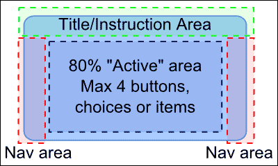
For kiosks, stick with a maximum of 4 options on the screen. It doesn't matter if they're arranged horizontally, vertically, or in a grid, but the (at most) 4 main options should take up about 80% of your screen real estate. Keep other necessary navigational elements in the margins, and use the left-hand, right-hand separation to indicate whether navigation is going to be in a forward direction or a backward direction:
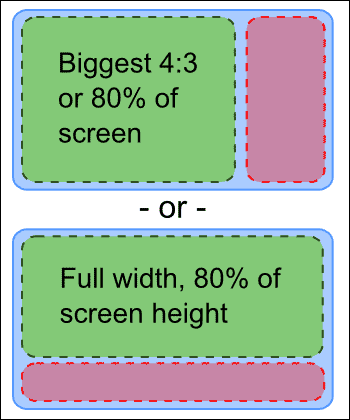
For digital signs, use NO MORE THAN TWO AREAS, PLEASE! One is almost always the right answer, but if you must divide the screen, stick again to the 80/20 rule, with 80% of your screen devoted to your primary content, and the remaining 20% occupied by a sidebar (seriously, no tickers). If you're working with 4:3 content, you can bend this rule to have the primary content occupy the largest possible 4:3 space:
Applying a little bit of common sense
While I suspect (or at least hope) that most of us wouldn't come up with the Rube Goldberg laundry contraption depicted above, I'm sure we've all deployed systems that were more complicated than they needed to be, either because our clients demanded it (and we didn't stick to our guns), or because we just couldn't think up anything better. I don't think it's necessary to take things to a Steve Jobs-esque level to be successful. (His approach can backfire anyway -- seriosuly, one mouse button?) But all else being equal, when you have the opportunity to remove, streamline or simplify your digital signage or kiosk content, you probably should give it a try. Oh, and don't forget to split test it once you do :)
Have you seen any self-service systems that were too complicated for their own good? Leave a comment and let us know.
 Subscribe to the Digital Signage Insider RSS feed