Question #1: How much do color and/or contrast affect recognition and recall of messages?
The first thing we wanted to test was the effect of color and contrast on message readability and recall. We've done plenty of research on color and contrast in the past, and had a good idea of what the results should look like ahead of time, which provided a useful quasi-control case. For example, we know that foreground and background color combinations with the same contrast values (like white on dark red and white on dark blue) perform about the same, while color combinations that improve the contrast ratio almost always do better. To test whether our Mechanical Turk-based simulation mimicked this reality, we created a series of images that varied both color palettes and contrast ratios (e.g. showing different shades of gray instead of just black and white), and then ran a few hundred trials. In all, we tested seven high-contrast color combinations recommended by ClearChannel as part of their guidelines for designing out-of-home ads. While there was no clear winner among these combinations (as was expected), we did see significant variance between contrast variations (also as was expected, thankfully):
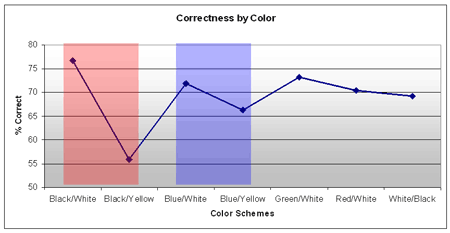
The scheme of white text on a black background significantly outperformed the lower-contrast yellow-on-black. Similarly, white-on-blue outperformed yellow-on-blue. Overall, black-on-white was the clear winner, even over white-on-black. This is probably because computer screens are best at showing white, since the red/green/blue components of each pixel must all be turned on to create the appearance of white light, making white the brightest of all possible colors.
Question #2: How does the length of a message influence recall rates?
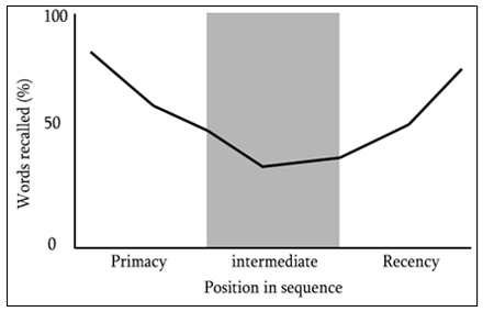
I've used this chart a few times, so it'll be familiar to regular readers. In short, 50-plus years of psychology research tells us that most people can only reliably remember nine or fewer items, with the sweet spot right around seven items. What's more, we tend to remember things at the beginning and the end of a list better than things in the middle of a list, due to optimizations in our brain called the primacy and recency effects. We thus created a series of test images to see how much difference even a few words might have on a viewer's ability to read and recall a message. The messages in our test images varied in length from 2 to 5 words, well within the "7±2" memory limit. We also looked to see if the primacy and recency effects ever came into play.
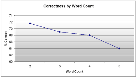
Once again, we were glad to see the Mechanical Turk results mimic those of the real-world research conducted in the past. We recorded a nearly 8 point difference in recall between two- and five-word phrases, which is actually slightly more significant than we expected to see. Admittedly, part of this is probably due to experimental error, since we didn't compare the recall rates of these particular phrases in plain text form -- although we wouldn't expect that data point to make a meaningful difference in our findings. Due to time constraints, we also didn't test longer phrases, but that's high on our future agenda, since plenty of real-world content features much longer text phrases and calls-to-action.
Question #3: How does the general brightness of the environment (i.e. ambient lighting) affect message recognition and recall?
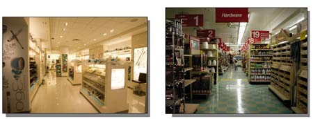
While content creation packages and digital signage playback systems give users fine-tuned control over every possible software setting, many screens are unfortunately destined to be deployed in less-than-ideal environments. We've all seen displays hung too far off of the ground, too far away from normal traffic flows, and even placed behind visual obstructions. In short, even the best-laid digital signage plans go astray when you have to deal with the constraints of your venue, and one of the biggest offenders is the high-brightness environment. It pains me to think how many millions of dollars have been wasted on screens, players, software and content that will simply never be seen because of the harsh interior lighting of their environments. We were certain that environmental brightness had a seriously negative impact on message recognition and recall, but were unsure of how to test this. (Just try going to your local Walmart or club store and asking them to change the lighting a few dozen times to see how shoppers react.) In the end, we settled for a less-than-perfect simulation featuring our mocked-up digital signage content placed into images of different shopping environments that used different kinds and amounts of ambient lighting. To make the screens look correctly washed out, we photographed them in a white (well, slightly yellow) room with controlled amounts of lighting, and then inserted them into the images of the shopping environments. We calculated the "average" brightness of an image by sampling all pixels and taking the mean. Interestingly, the 99 distinct images we created naturally fell into only 6 distinct brightness categories.
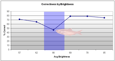
We plotted the percentage of correct answers against the screen's <i>relative</i> brightness -- how much brighter the screen appeared compared to its surroundings -- to produce the graph above, and surprisingly found little correlation between brightness and recall. The sharp decline for the 66% relative brightness category also caused some confusion, until we went back and reviewed that set of images and found that virtually all of them happened to have the highest visual clutter values. As we'll discuss in an upcoming article, high visual clutter causes a big dropoff in recall. We didn't have time to re-test with a better range of 66-brightness images, but I expect that if we did, the results would have been in line with the rest of the chart.
In case you're wondering, the Mechanical Turk results held up nicely when compared to real-world data from earlier studies. We never did a formal statistical analysis, since our data gathering methods and the data itself were just too different. But based on simple correlations and our own industry experience, these results are definitely "correct" enough to act on. In the next article, we'll cover the rest of the variables we tested: screen orientation, screen size, and the "vampire effect" (i.e. what happens to viewer attention when your screen's environment is full of people... or Twilight books). I know you're just dying to know whether to hang your screens vertically or horizontally, so be sure to check back in, same time, same channel.
 Subscribe to the Digital Signage Insider RSS feed