- DON'T use multiple font faces: Mixing sans-serif and serif fonts together (for example, using Arial and Times in the same sentence) makes it much harder to read. In some tests, using multiple fonts increased the average time-to-read by 100%, though I suspect that at least part of that time was spent trying to figure out exactly what was unusual about the sentence. I'd suggest limiting yourself to no more than two fonts in any given "scene" in your content.
- DON'T use all caps: While you might think that an all-caps sentence would be easier to see and read, the opposite is true. An all-caps line will visually block together and take longer to read and decipher than a normally-capitalized line. It's still OK to use capitalization for emphasis, of course, but I recommend limiting that to a single word or two.
- DON'T stack lines: Just like the all-caps note above, stacking lines of text directly on top of each other can make them more graphically pleasing, but often comes at the expense of readability. If you must use multiple lines of text in your content, keep them visually separate from other items on the screen at the same time. It's also a good idea to use a high-contrast color scheme to make the letters as distinct and easy-to-read as possible.
- DON'T abuse colored text: I completely understand that digital signs can show off a wide array of eye-catching colors, gradients and other effects, so I don't want to suggest that everything should be (literally) black and white. However, we've also found that when you have less contrast between the text and the background, the message takes longer to read and is harder to see from a distance. So, you can go ahead and use your bright red copy on a pale beige gradient background, but think twice before throwing some chartreuse text onto a spring green background.
- DON'T skew text: One of the more surprising results from our study was that skewing or slanting text -- even something as simple as going from Arial to Arial Italic -- can have a pretty serious impact on visibility and time-to-read. The more severe the slant, the more pronounced this effect was. So if you don't have to use italics, it's best to avoid this effect entirely.
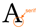 DO use sans-serif fonts whenever possible: Serifs are those little dangly things on letters that make them look fancy. Many studies have looked at whether serifs make particular fonts easier or harder to read, and there's evidence in favor of both sides. My personal feeling is that serifs make small text easier to read, which is why these fonts are common in books and newspapers. But when it comes to digital signs and other large-format media, you'll get the best results if you focus on sans-serif fonts. If you think about it, this makes sense: when the viewer only has a second or two to read text on a screen that's several feet away, the simple shapes of sans-serif fonts take less cognitive effort to recognize and decipher.
- DO make your text big enough: Small text is probably the most common problem that I see on digital signs. Without my glasses on, my vision is about 20/40 -- not terrible, but not great either. But with them on, it's 20/15, which is better than average. So why do I still find myself squinting and walking towards the screen just to figure out what it says? As a starting point, here is what Clear Channel recommends for text shown on roadside billboards:
Viewing Distance (feet) Minimum Readable Text Height (inches) 5' - 50' 1" - 2" 50' - 100' 2" - 4" 100' - 200' 4" - 8"
The Kentucky Department of Transportation and the OAAA have come up with similar guidelines, and if anything, our own research says to err towards the higher end of these recommendations. What does this mean for you? Well, on a typical 40" screen at 720p resolution, your text should be at least 70 pixels tall if you want people to read it from a few yards away.
The Digital Signage Insider
Making great digital signage content: Sorting out font faces, sizes and styles
Published on: 2008-04-16
If you've worked in an office at any point in the past decade, then you probably know that guy. His reports, his memos, his typewritten pleas to buy his daughter's Girl Scout cookies... everything he puts on paper uses (gasp) Comic Sans. I don't know who designed that font, but clearly he couldn't have known the full extent of the carnage to come: book reports, birthday cards, banners, websites -- a seemingly endless number of documents have been printed using this over-the-top, hard-to-read typeface. No, there's nothing funny about Comic Sans, especially if you've tried using it in your digital signage content. As it turns out, the font you choose can have a significant impact on how much of your message the casual viewer will read and comprehend before moving on. We first talked about text sizes back in 2004, and in today's post we're going to take a closer look at some typography do's and don'ts to help you get the most from your content:
 Subscribe to the Digital Signage Insider RSS feed