The importance of context
In July 2007, we wrote about a study done by Mediaedge:cia (MEC) on consumer attention habits. MEC's study determined that context and content are more important than location for influencing people's attention, largely because people are typically paying attention to many things simultaneously. Therefore, they concluded, the optimal role for commercial communication content is not to work within a person's partial attention, but to pull him out of it into full focus. MEC's research showed that "people can and will give attention to commercial communications... but only when and where it suits them." Thus, it's our job to (a) maximize the chance that potential viewers look at our screens, and (b) make sure that when they do look, they immediately understand the meaning that we're trying to convey. The key to both of these items is contextual relevance. For example, take the following image:

Context can affect recognition and even the way that messages and symbols are translated into concepts. What that means is that depending on a person's psychological context (which is greatly influenced by where they are and what they're doing), they might think of different things when shown the same image. For example, if you saw the skull and crossbones image in a pharmacy or on a safety poster in your office stockroom, it would (probably) immediately equate to danger or poison. Subconsciously primed with that association, you would be much more likely to read any message with the fear and caution that goes along with that state of mind. However, if you saw that image at Disney World, a movie store or some other entertainment venue, the symbol might instead be interpreted as "pirates". In that case, you would be primed with a completely different set of feelings and emotions when receiving the rest of the on-screen message.
This is not to say that you or your viewers can be easily fooled into thinking a symbol means one thing or another. In reality, most people will understand the purpose of the message after reading it for a few seconds. But to give your content the best chance of attracting and retaining viewers' attention, the symbols and materials used need to be as relevant to the viewer as possible, and they need to convey the right intent at the particular venue they're shown at. Luckily, familiarity with a particular context facilitates perception within that context; that is, we pick up on things more quickly in familiar environments. So this effect would probably be more pronounced at an unfamiliar airport than at your local grocery store, for example.
Watch out for attention vampires
It's difficult to create a spot that's eye-catching, easy-to-understand and memorable. However, it's all too easy to include graphical elements that draw viewer attention away from the critical part of your content: the message itself. We first covered this phenomenon last June, when studies from PreTesting (which focused on TV commercials) and GfK (who studied magazine ads) found that the eye candy that makes an ad aesthetically pleasing can also dull down the brand or product message -- to the point where viewers can't recall it later. Images of things we're biologically programmed to notice (like people's faces, babies or top predators, for example) draw attention away from other areas that might contain important information. When used improperly or accidentally, the attention vampire effect can divert attention from the star of your content. However, when used correctly, they can promote viewer attention in key areas and hold that attention for relatively long periods of time. For example, consider the image below, which shows where people glanced the most within a Bulgari magazine ad:
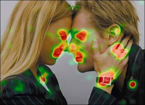
As you can see, the people's faces drew the vast majority of viewer attention, followed in equal parts by the watch (the focus of the ad) and the other shiny things in the scene (jewelry). For Bulgari, this might be acceptable and even desirable in a print advertisement: they are selling a lifestyle, not necessarily just a product. But in a digital signage ad that may only have 1-3 seconds to get the message across, such a concept is too subtle, and the predominant use of faces diverts too much attention away from the actual product. Regardless of which side of the fence you might be on, it's easy to see how grabbing a viewer's attention with one of these vampire images could be used to benefit digital signage content and hold viewer attention. By the same token, it's easy to understand how it might be misused and ultimately distract viewers who would otherwise be ready to receive your message.
By now, I hope this series on creating digital signage content has taught you how to make your messages more relevant, memorable, and distraction-free. But what goes into those great messages, and what kinds of messages work best at grabbing and holding viewer attention? Find out next week, when we'll take a look at what works -- and what doesn't -- when it comes to writing effective copy for digital signage ads.
 Subscribe to the Digital Signage Insider RSS feed