Ten years ago, the number of retailers, hospitals, hotels, etc. that had deployed large numbers of flat screens (standard-definition at the time) was very small. The screens were still expensive, there were questions about longevity of the display panels, and frankly, there just wasn't much reason to deploy them. Fast forward to today, and virtually every space you enter is littered with flat panels of all sizes. Many of these displays are connected to a computer that's running some kind of rudimentary signage or presentation software (indeed, PowerPoint still seems to be a favorite for many small businesses). Many more are just regular TVs, and this latter group represents an excellent conversion target over the next few years.
The 3-zone: We all know it, we may not like it, but it sells
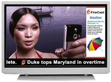
The 3-zone (or "L-bar") screen has more or less been the unofficial, official layout of the digital signage industry for the last decade. It has a nice, big space for primary content, a sidebar for secondary (and potentially related) content, and a nice little box to put the infamous ticker in. Of course, the simple layout and obvious differences in the aspect ratios of each zone have also caused it to become the most abused layout around. More often than not, the 3-zone gets stuffed full of mediocre primary content, unrelated (and frequently useless) secondary content, and a tiny, unreadable bar of scrolling text. For digital signage networks intended to get a certain message out (and isn't that all of them?), going with this layout can easily produce worse results than sticking with a single zone of full-screen content.
However, the industry has done such a good job of promoting this idea of what a digital sign "ought" to look like that people have come to expect this exact layout unless they have some specific application in mind. So, ask a mom-and-pop restaurant owner what they'd want and they'll tell you: the 3-zone. Auto dealer? the 3-zone. Doctor's waiting room? The 3-zone. And so it goes.
From a messaging perspective, the situation is far from ideal. From a sales standpoint, though, it's not so bad. Consider the aforementioned group of people out there who already have one or more large flat panels set up in their venues to just show regular TV. Many of these folks are prime candidates for an easy digital signage upsell. People in this category often lack a clear vision of what digital signage functionality will do for them, but they know they want more than "just TV." This often translates to still showing TV in some portion of the screen, but also showing secondary information (that's typically unrelated to the primary TV content) next to it. And more often than not, they want a ticker, too. Why? Beats me. But people still seem to love scrolling text, even if they can't read it.
So take the need for a large content zone for the TV signal and a smaller zone for secondary information, add the ability to place a ticker as well, and what do you get? Yup, our old standard, the 3-zone.
Picking your battles
I can't even begin to estimate the number of hours I've spent researching various strategies for optimizing digital signage content so that it gets your message out to your viewers in the best possible fashion. As a pragmatist, though, I know that at the end of the day, a lot of people don't care about that. They just want an eye-catching solution that gives their screens a bit more flair than the next guy. So instead of pitching the "right" solution, I've instead turned (some) attention to helping VARs and integrators come up with reasonable ways to use the 3-zone and other similar screen layouts. With some nice demo content and a good pitch that includes useful ways to employ the second and third zones, our partners get a nice-looking and quick-selling package that customers seem to want to buy. Meanwhile, their customers get something that's eye-catching and is more than "just TV", and I can sleep soundly knowing that even if more 3-zones are being deployed, at least they're being put together with a little more thought and planning than just weather on the right and a stock ticker at the bottom.
 Subscribe to the Digital Signage Insider RSS feed