The Decompression Zone
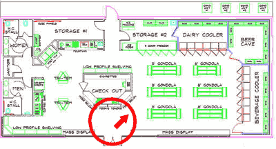
You've all read Why We Buy: The Science of Shopping by now, right? No? But it was on our summer reading list. Surely you breezed through all of those weighty tomes during your downtime, right? Well, if you had, you'd probably remember that in that book, author and retail anthropologist Paco Underhill identified something peculiar about the entryway to a retail space: namely, we don't notice anything about it when we walk in. You see, shoppers change walking gait and mental state when moving into a store, especially from outside. Once in the store, they tend to ignore the first 10 to 15 feet of space. And unless they have a specific destination in mind (e.g. the checkout counter in the floor plan for a convenience store as shown below), they tend to move ahead and to the right, beginning a counter-clockwise path through the store.
Consequently, the decompression zone is a veritable no-man's land when it comes to messaging. Many folks still tack up posters and install POP displays at or near the store entrance. But at best, these work like visual "speed bumps" that attempt to get the shopper to slow down and start processing the displays. With a poster or cardboard POP display, that might not be too bad. But using a digital sign for that purpose? That's an expensive proposition. Consequently, we usually recommend that customers avoid installing digital signs at the store entrance. Are there ways to do it that are attractive and effective? Sure, probably. But are there better places to spend the money? Most definitely. Don't believe me? I'll give you an example.
Location, Location, Location, Baby
A few years ago, we did a project for a chain of large furniture showrooms in Florida. The chain wanted both kiosks and digital signs installed. The kiosks would print coupons and allow prospective customers to apply for a line of credit. The digital signs would advertise the services available on the kiosks (since in-store credit is a big money maker for furniture stores), as well as show some ads for current specials. The digital signs were mounted directly on top of the kiosks on large stands that stood about six feet off the ground. This made both screen and kiosk very easy to spot, even across the large showroom floors.
In our case, we also found that transaction volume (which I'm using here as a proxy for engaged viewership) was also directly proportional to the amount of floor traffic in the area. We thus learned, over time, to simply keep the devices in the most heavily-trafficked parts of the store, excluding the entry landings. In this example, we had the good fortune to have access to the transaction data from the kiosks, which represents bona fide interactions between the device and a shopper. For more traditional non-interactive screens, coming up with an understanding of who's watching will be more challenging, and will likely require some kind of visual measurement (either using people or technology -- or probably both). By the way, if you want to learn more about analyzing foot traffic within a venue, check out this vintage article on using store traffic patterns to optimize digital sign placement.
So far, I've given you a lesson on what not to do, but you're probably wondering what you should be doing in terms of planning out your digital signage screen arrangements. Well, that will have to wait for next week's installment, when we take a look at viewing angles, the angle of approach, and making sure that your screens get seen when shoppers are most receptive to messaging. (We're about to launch our new FireCast Digital Signage EasyStart product for small networks next week, so it might be teensy bit delayed, but I'll try my best.)
Have you had any success with marketing to shoppers in the "decompression zone"? We're sure it can be done, and we'd love to hear some first-hand accounts. Take a moment and share by leaving a comment below.
 Subscribe to the Digital Signage Insider RSS feed
Comments
RSS feed for comments to this post